TEST
USABILITY TEST OBJECTIVE
I ran remote usability testing to validate two core journeys: (1) ensuring first-time mobile users could modify their weekly study goals and seamlessly resume Today’s Class, and (2) confirming they could schedule a Mentor on Demand session end to end without moderator help. The sessions focused on measuring clarity, findability, and decision friction across both flows.
TASKS
-
Today’s Class - Modify Goals - Continue Learning (add a study day, save, resume today’s lesson)
-
Mentor on Demand scheduling (choose topic - length - date/time - confirm)
TOPLINE RESULTS
-
Completion: 100% (both tasks)
-
Ease: ~6.7/7 avg
-
Confidence: 5/5 avg
-
Overall vibe: Clean, intuitive, motivating; progress visuals & checklists work well.
WHAT WORKED
Usability testing confirmed a clear hierarchy with Continue Learning placed where users expected it. The Connect with Mentor button was easy to find, and motivation elements like progress percentages and checklists encouraged momentum. The cohesive use of purple tones, type scale, and card layout strengthened the SkillBridge brand’s clarity and focus.

MID-FIDELITY WIREFRAMES
VISUAL IDENTITY
VOICE & TONE
-
Voice & Tone: Professional, encouraging, empowering, clear.
-
Pillars: Guided Growth, Clarity, Flexibility, Support, and Confidence.
-
Brand potential: Flexible enough for both personal upskilling and professional development.
BRAND DESIGN SYSTEM
SkillBridge’s design is about clarity and growth. With purple as the primary color for creativity and ambition, paired with clean type and simple layouts, the product feels motivating and easy to use. Every choice supports learners in staying consistent and confident.

UI COMPONENT LIBRARY
My visual design choices have made the experience feel clearer and more motivating, which aligns well with what my personas value: structure, support, and confidence in their learning. Using purple as the primary color gives the product a sense of creativity and ambition, while clean typography and layouts keep it approachable. I think my ideal persona would feel encouraged to use it.


Case Study: MOBILE-FIRST RESPONSIVE WEBSITE
SKILLBRIDGE
A learning platform that guides you with personalized plans, progress tracking, and on demand mentorship.
My Role
UI/UX Design, Branding, Research, Personas, User flow, Wireframing, Prototyping, Usability testing
Timeline
August 2025 — September 2025
Tools
Figma, Photoshop, Illustartor, Zoom
BACKGROUND
With technology and careers evolving rapidly, continuous learning is essential. Many career changers and lifelong learners struggle to stay consistent amid busy schedules and information overload. This project explores what truly sustains motivation and how mentorship or peer support can enhance long-term engagement.
EMPHATIZE
USER INTERVIEWS
Goal: To understand what drives consistent learning and how structure, resources, accountability, and mentorship can work together to reduce drop-off and boost completion.
Approach: I conducted 6 in-depth user interviews with career changers, professionals, and hobby learners.

KEY FINDINGS
Several key themes emerged from the affinity map grouping.
-
Motivation & Consistency Learners begin motivated by career goals, curiosity, or identity, but their momentum fades without consistent reinforcement or reminders.
-
Pain Points Scattered resources, mismatched courses, and technical limitations often derail learning progress.
-
Strategies & Behaviors Learners create self-made systems like tutorials, notes, and planners, but these are often fragile, inconsistent, and eventually abandoned.
-
Community & Mentorship Learners value support during moments of struggle but don’t always seek constant community interaction.
-
Accountability & Structure Time blocking, gamification, and reminders help sustain habits, but systems must stay flexible—too rigid leads to burnout, too soft to neglect.

COMPETITIVE ANALYSIS
Opportunity:
During the competitive analysis, I found that none of the competitors combine structure, motivation, and personalized support in a single platform.
DEFINE
USER PERSONAS
Creating a user personas allowed me to better understand learners’ goals, challenges, and motivations. These insights helped me shape SkillBridge to deliver a more personalized and empathetic experience that truly responds to users’ needs and pain points.


POV STATEMENT
Learners often feel overwhelmed by too many tools, poor course fit, or technical barriers.This mismatch between expectations and reality causes frustration and drop-off.
HMW QUESTIONS
-
How might we provide on-demand mentorship/peer support without forcing constant interaction?
-
How might we prevent learners from feeling overwhelmed or lost in rabbit holes?
IDEATE
PRIORITY FEATURES
Based on user interviews, I've identified the main features needed to ensure the user's needs are met.
-
Mentor on Demand: Book quick, focused help sessions when stuck.
-
Today’s Class Dashboard: Central hub with streaks, progress, and gentle reminders.
-
Rescope Wizard (AI): Rebalances the learning plan based on user availability.
INFORMATION ARCHITECTURE
By creating this sitemap, I established a clear flow between the website’s key sections, providing a blueprint for an experience that feels organized and easy to explore.

TASK FLOWS
Creating the task flow helped me visualize how users move through key actions like setting goals or booking a mentor and identify friction points early. It translated user needs into clear, testable interactions that shaped the structure of wireframes and prototypes.

MID-FIDELITY WIREFRAMES
Using mid-fidelity wireframes lets me focus on layout and information hierarchy without getting bogged down by visual styling, making this stage essential for gathering feedback and iterating before advancing.
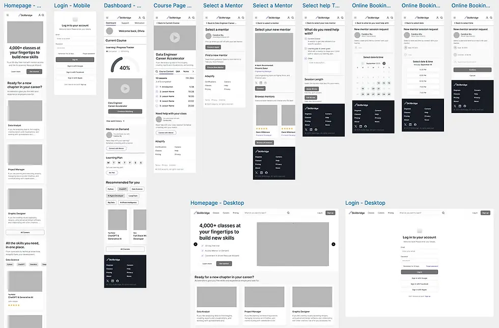
MID-FIDELITY WIREFRAMES
PROTOTYPE
HIGH-FIDELITY PROTOTYPE
I translated research insights into an interactive prototype focused on daily usability and motivation flow.
KEY SCREENS
-
Dashboard / Today’s Class: Displays weekly targets, streaks, and upcoming milestones.
-
Weekly Learning Goal Flow: Screens that let users adjust their weekly learning goal.
-
Mentor Booking Flow: Lets users quickly choose a topic, session length, and time, then confirm their session.
MID-FIDELITY WIREFRAMES
VISUAL IDENTITY
VOICE & TONE
-
Voice & Tone: Professional, encouraging, empowering, clear.
-
Pillars: Guided Growth, Clarity, Flexibility, Support, and Confidence.
-
Brand potential: Flexible enough for both personal upskilling and professional development.
VOICE AND TONE
The SkillBridge voice is professional, empowering, and clear, reflecting its pillars of Guided Growth, Clarity, Flexibility, Support, and Confidence. It speaks with empathy and purpose, positioning SkillBridge as a trusted partner for personal and professional growth.
BRAND DESIGN SYSTEM
SkillBridge’s design is about clarity and growth. With purple as the primary color for creativity and ambition, paired with clean type and simple layouts, the product feels motivating and easy to use. Every choice supports learners in staying consistent and confident.
UI COMPONENT LIBRARY
My visual design choices have made the experience feel clearer and more motivating, which aligns well with what my personas value: structure, support, and confidence in their learning. Using purple as the primary color gives the product a sense of creativity and ambition, while clean typography and layouts keep it approachable. I think my ideal persona would feel encouraged to use it.
EMPHATIZE
USER INTERVIEWS
Goal: To understand what drives consistent learning and how structure, resources, accountability, and mentorship can work together to reduce drop-off and boost completion.
Approach: I conducted 6 in-depth user interviews with career changers, professionals, and hobby learners.
Key Takeaways:
-
Learners are motivated by career goals, curiosity, and personal growth, but motivation alone isn’t enough to sustain progress.
-
Overwhelm, technical barriers, and life demands often disrupt learning, making structure and accountability essential.
-
Consistency improves when learners combine structured habits with supportive systems like mentors, reminders, and peer networks.