

Capstone Project: END TO END APP
CARESYNC
CareSync is a patient focused healthcare companion app that helps patients and caregivers prepare for doctor visits, record appointments, and use AI to structure clear next steps. By summarizing conversations and identifying symptoms and action items, CareSync turns medical discussions into clear, trustworthy summaries that support clarity, user control, and follow through in high stress medical interactions.
My Role
UX/UI Designer
Timeline
3-week project (November 2025)
Tools
Figma, FigJam, Photoshop, Illustrator, ChatGPT and Replit
BACKGROUND
This project was inspired by my experience managing healthcare for my wife, a toddler, an aging parent, and myself across multiple providers, insurance plans, and platforms. Relying on scattered notes, manual reminders, and visit preparation often led to missed questions during appointments and unclear follow up afterward. This project explores how a thoughtfully designed digital tool, supported by AI, can reduce cognitive overload, improve clarity, and help patients and caregivers act confidently on medical advice.
EMPHATIZE
USER INTERVIEWS
Goal: The user interviews focused on understanding how patients and caregivers prepare for medical visits, capture and process information during appointments, and follow through afterward while identifying where stress, cognitive overload, and fragmented tools disrupt this flow and how AI could support that process.
Approach: I conducted five semi structured interviews on Zoom with adults who regularly attend or manage medical appointments for themselves or family members. Each session lasted 30 to 40 minutes and was recorded with verbal consent.

MID-FIDELITY WIREFRAMES
KEY FINDINGS
After conducting the interviews and organizing the findings through affinity mapping, several key themes emerged.
-
Preparation Habits & Challenges Most people use fragmented tools like Apple notes or mental lists to prepare for doctor visits, which often results in missed questions and incomplete conversations.
-
During the Appointment – Memory, Anxiety & Understanding Stress and time pressure significantly reduce comprehension, limiting people’s ability to absorb information unless it feels immediately urgent or painful.
-
After the Visit – Information Storage & Follow-Through Health information becomes fragmented across apps and portals, making it hard to track next steps or revisit what was discussed.
-
Trust, Privacy & Openness to AI People are curious about AI support for summaries and transcription but need full transparency, consent, and control to feel comfortable.
-
Desired Future Experience Users imagine a reliable, centralized companion that unifies their health data, highlights patterns, and simplifies communication before and after appointments.

COMPETITIVE ANALYSIS
Approach: I conducted a competitive analysis of patient portals such as MyChart and Healow, visit recording tools such as Medcorder, and AI driven solutions such as Abridge to understand how current products support medical visits across preparation, capture, and follow up.
Opportunity for CareSync: No single competitor supports the full medical visit journey from preparation to follow up while combining empathetic UX, guided preparation, AI powered summaries that translate conversations into clear action steps, caregiver friendly sharing with transparent privacy controls, and a modern visual design that reduces anxiety and cognitive load.

DEFINE
USER PERSONAS
Based on qualitative interviews, two core user archetypes emerged for CareSync: self managing patients and everyday caregivers. While their responsibilities differ, both struggle with fragmented tools, cognitive overload, and unclear follow through.


POV STATEMENT
Users need a simple, organized way to prepare for and retain key details from medical visits because fragmented notes, limited time, and emotional stress make it hard to feel confident before, during, and after appointments.
HMW QUESTIONS
-
How might we help users capture and organize symptoms, questions, and concerns as they arise?
-
How might we summarize notes and conversations clearly, while keeping users in control of their data?
IDEATE
PRIORITY FEATURES
Based on insights from user interviews, competitive analysis, and the defined user personas, I identified key pain points and translated them into a focused set of MVP features. Due to the short timeframe of the project, I prioritized the top three features to ensure the most critical user needs were addressed first.
-
Smart Symptom & Question Log: A simple, structured space to capture symptoms, notes, and questions by date and topic.
-
Voice-to-Note Assistant: Quick voice capture of new symptoms or reminders without typing.
-
Al Visit Summarizer: With consent, records doctor visits and turns them into clear summaries with actions and follow ups.
INFORMATION ARCHITECTURE
By creating the CareSync sitemap, I defined a clear information flow across key sections, establishing a structural blueprint for an experience that feels intuitive, organized, and easy to navigate.

USER FLOW
Creating a user flow helped me map onboarding, appointment setup, and visit preparation. This clarified when users needed to review questions, grant recording consent, start or stop a recording, and review visit summaries, helping uncover friction early and inform a structure that feels intuitive, trustworthy, and aligned with user needs.

LOW-FIDELITY WIREFRAMES
I created low fidelity wireframes using Replit and conducted a short group usability discussion to evaluate the clarity and logic of the CareSync MVP prototype, from onboarding through AI generated visit summaries. Four peers and an instructor participated, providing feedback on flow clarity, copy consistency, and overall structure.
What was tested:
-
“Add a receipt” flow (photo capture, confirmation, optional reminders).
-
Early ideas for warranty/return reminders.
-
Clarity of receipt capture and warranty setup confirmation messages.
MID-FIDELITY WIREFRAMES
MID-FIDELITY WIREFRAMES
KEY FINDINGS
Usability testing showed that combining too many interactions in a single flow reduced clarity, and users had difficulty understanding which actions happened before, during, or after a visit. Confusion around recording, transcription, and AI summaries highlighted the need for clearer consent, transparency, and data flow. Inconsistent copy and caregiver setup expectations further emphasized the importance of a more structured and clearly labeled experience.
At the same time, participants validated the core concept, confirming that AI-powered preparation and visit summaries address real user needs. The primary takeaway was the need to simplify the experience and clearly define when and how users interact with each feature.


MID-FIDELITY WIREFRAMES
KEY FINDINGS
Participants found the CareSync concept valuable and easy to follow, with clear, realistic copy supporting comprehension. Usability feedback identified focused opportunities for refinement before high fidelity design..
-
Too many steps before starting recording Users felt the path to start recording was too long and wanted faster access from the timeline, since real doctor conversations often begin immediately.
-
Recording consent felt intimidating Add explicit details about privacy, consent, and data ownership.
-
UI alignment and navigation inconsistencies Standardize header alignment with consistent spacing, hierarchy, and typography.
MID-FIDELITY WIREFRAMES
Next, I conducted mid-fidelity usability testing to validate updates made in response to low-fidelity feedback and assess refinements to CareSync’s core MVP flows, from visit preparation through conversation capture and summary review. Testing consisted of live walkthroughs with users, with insights gathered through observation and open discussion.
What was tested:
-
Onboarding & Appointment Setup (Pre-Visit Planning)
-
Prepare for Visit, Recording, End Visit, Summary, Add to Timeline
PROTOTYPE
HIGH-FIDELITY PROTOTYPE
Based on mid-fidelity usability feedback, I refined the UI, added FAQs to clarify recording consent, and introduced a quick record button to reduce friction.

MID-FIDELITY WIREFRAMES
VISUAL IDENTITY
I designed CareSync’s brand identity around clarity, empathy, and trust, with the goal of helping people feel calm, informed, and in control throughout their healthcare journey.
BRAND GUIDELINES
I shaped the CareSync app experience to prioritize clarity, trust, and peace of mind during high-stress medical moments. Blue conveys calm and reliability, while a clean layout and simple sans serif typography reduce cognitive load. The logo combines a heart and microphone, representing empathy and CareSync’s core function of recording conversations and delivering clear summaries.

UI COMPONENT LIBRARY
I created a foundational UI component library for CareSync to ensure visual consistency while preparing the design system for future feature expansion. Establishing shared components made the interface more scalable and enabled faster iteration and more efficient updates as new features were introduced.

USABILITY TEST
TEST GOALS & OBJECTIVES
The goal of high-fidelity usability testing was for me to validate the clarity, emotional tone, and efficiency of CareSync’s two primary user journeys: onboarding and appointment setup, and preparing for and starting a visit. Testing evaluated whether the experience feels clear, trustworthy, and supportive during time-sensitive healthcare moments.
OBJECTIVES
-
Validate clarity and ease of use across key flows.
-
Assess trust, privacy perception, and comfort with recording.
-
Identify usability friction during recording and summary review.
-
Assess clarity of copy, hierarchy, and visual cues.
METHOD
-
Format: Remote (Zoom) + Figma clickable prototype.
-
Participants: Five users participated, who were self-managing patients and caregivers that regularly attend medical appointments and are moderately comfortable with digital apps.
-
Tasks: Two sequential flows — (1) Onboarding & Appointment Setup and (2) Preparing & Starting a Visit.
-
Metrics: Ease of completion (1–5 scale) after each flow, focusing on clarity, trust, and perceived success, and open-ended qualitative feedback.
TEST FLOWS
-
Onboarding & Appointment Setup: Users reviewed prefilled profile details, added an appointment, and confirmed it appeared in their timeline before starting a visit.
-
Preparing & Starting a Visit: Users prepared for a visit, reviewed their questions, confirmed recording consent, recorded the visit, and reviewed the AI-generated summary and transcript.
WHAT WORKED WELL
Usability testing confirmed that CareSync feels clear, trustworthy, and supportive during medical visits, with a design that users described as professional and easy to follow. Users felt confident their information was saved, appreciated question review for reducing anxiety, and found the AI-generated summaries genuinely useful for recall and follow-up.
-
Strong trust signals: The interface felt professional and comparable to existing healthcare tools, helping users feel comfortable sharing sensitive information.
-
Preparation reduced anxiety: Reviewing questions before a visit helped users feel more confident and organized right before speaking with a doctor.
-
AI summary added real value: Users appreciated having a concise, scannable summary supported by audio and transcript playback as a reliable backup.
PRIORITIZED CHANGES
Usability testing revealed actionable insights that informed a prioritized set of design updates to improve clarity and flow. I implemented all high-impact, low-effort changes and addressed key medium-impact, medium-effort improvements to further refine the experience.

PRIORITIZED CHANGES
Copy precision: I improved copy clarity by renaming “Schedule Appointment” to “Add Appointment” to avoid implying real-time booking and better match user expectations. In addition, I updated “Name” to “Full Name” on the account creation screen and added AM/PM to appointment times to reduce ambiguity.

PRIORITIZED CHANGES
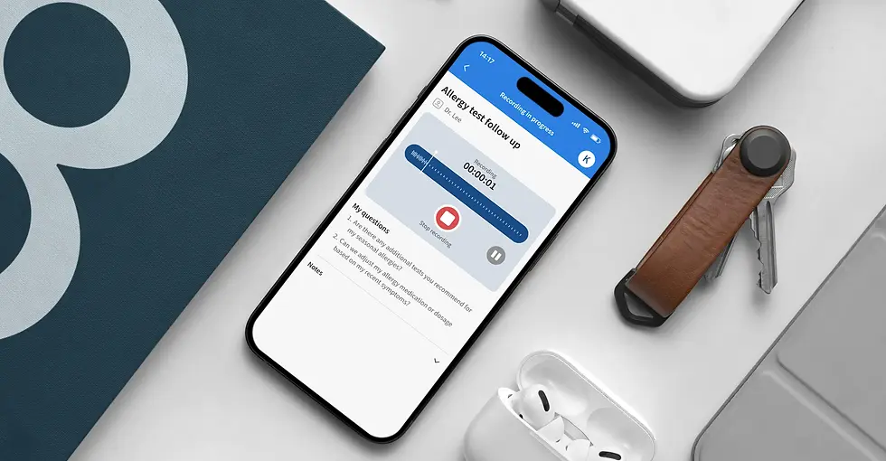
Recording control clarity: I introduced explicit Start and Stop recording controls and added a pause and resume option once recording begins. I also included clear confirmation messaging after a recording ends, ensuring users understand recording states and feel confident their visit was captured correctly.

PRIORITIZED CHANGES
Clear transitions: To reduce uncertainty after recording ends, I added clear confirmation feedback and a “View Summary” call to action. I also surfaced a “Recording finished” status in the header to clearly communicate the system state and guide users to the next step.
FINAL DESIGN
VOICE & TONE
-
Voice & Tone: Professional, encouraging, empowering, clear.
-
Pillars: Guided Growth, Clarity, Flexibility, Support, and Confidence.
-
Brand potential: Flexible enough for both personal upskilling and professional development.

MID-FIDELITY WIREFRAMES
SELECTED SCREENS
SkillBridge’s design is about clarity and growth. With purple as the primary color for creativity and ambition, paired with clean type and simple layouts, the product feels motivating and easy to use. Every choice supports learners in staying consistent and confident.


CONCLUSION
KEY TAKEAWAYS
Through a research-driven and iterative design process, CareSync evolved into a patient-centered product concept that supports preparation, understanding, and follow-through during healthcare visits. As an end-to-end capstone delivered within a three-week timeline, I defined the problem space, prioritized core user needs, and led UX from discovery through high-fidelity prototyping and usability testing, making deliberate tradeoffs to maximize impact. The project reinforced the importance of clear prioritization, designing for trust in sensitive contexts, and iterating quickly based on real user feedback.
FUTURE ENHANCMENTS
-
Trust & transparency: Provide clearer explanations of data handling, storage, and user control over recordings and summaries.
-
Document capture for visits: Allow users to photograph exercise sheets or printed handouts and store them with the related visit.
-
Health portal integration (long-term): Integrate with patient portals such as MyChart to import appointments, labs, and clinical data.
-
First-time user guidance: Add lightweight onboarding cues or empty-state guidance, such as “Welcome! Start by adding your first appointment,” to help new users get started.
MID-FIDELITY WIREFRAMES